INTRODUCING PROJECT
Develop the visual concept of the program and create designs related to the program, and define the design standards.
Collaborate and discuss with the program team to confirm the relevant materials for video production.
Six videos with a total of 81.9K views, enabling learners to understand the knowledge related to the subjects.
"Knowledge Dose" is a science education program created for high school students. The program consists of six episodes where three teachers and one teaching assistant answer questions related to physics, biology, and earth science. The program is designed to help students better understand these challenging subjects.


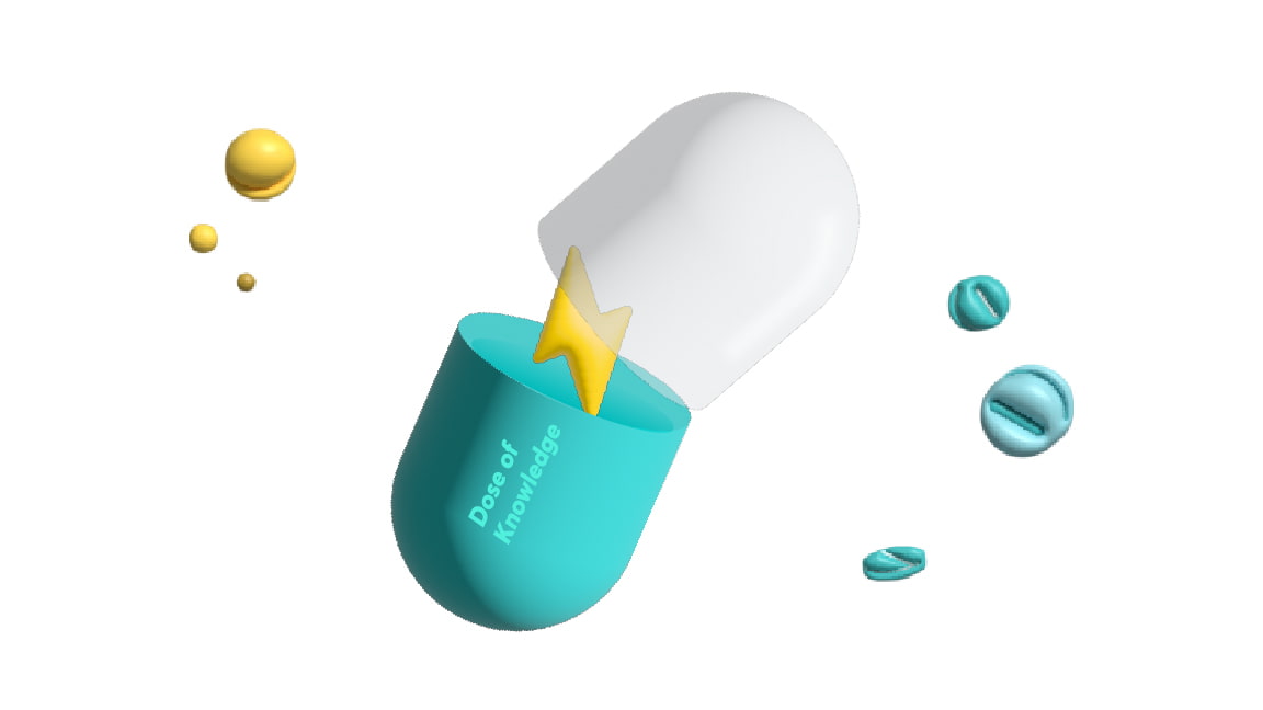
The visual concept of the program is inspired by a modern pharmacy, with a light color scheme of blue, green, and yellow, and illustrations of pharmacy-related elements that create a consistent and distinctive design. The design team collaborated with the program's creators to ensure that the visual materials matched the video content.

Subtitle design covers a wide range of contexts, including chapter headings, key summaries, questions and answers, and situational explanations. Depending on the intended use, diverse subtitle designs are created with various styles and geometric illustrations, accompanied by subtle color tones. The result is not only visually pleasing but also captivating.


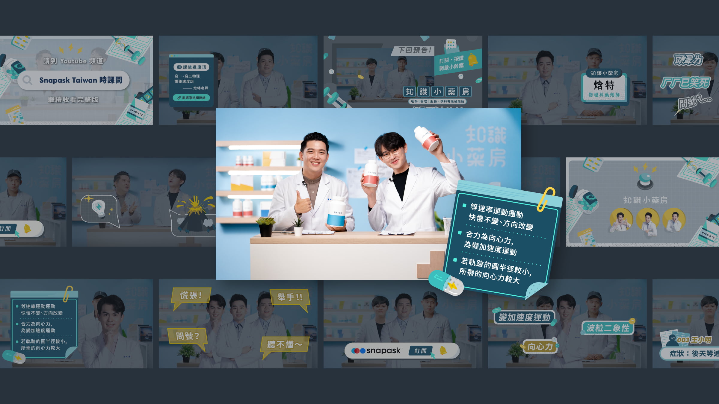


The design elements use a contrast of blue, green, and yellow, with a light background to create a clean and bright atmosphere. The use of light and dark contrast helps viewers focus on the important points. The illustrations are rounded and friendly to create an enjoyable viewing experience, and two fonts, JF font and Noto Sans, were used to provide a professional yet approachable design. JF font is a refined font from a Taiwanese font company, which has rounded features similar to a serif font, making it suitable for professional and friendly design. With a lot of traditional Chinese content in the program, it was important to choose an appropriate font.